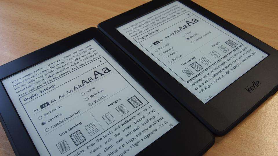
Amazon is upgrading several models of the Kindle with a new font and other features designed to improve the readability of eBooks. Version 5.6.5 of the Kindle software brings Amazon's own Bookerly font to many different models of the eReader, having first been introduced on the 2015 model of the Kindle Paperwhite .
Our reviewer declared the Bookerly font an improvement on its predecessor, arguing that it was " less chunky looking than the old default Caecilia font, and has some finer touches that become apparent at larger sizes". It's now being rolled out to the Kindle Voyage, Kindle Touch, the seventh generation Kindle and previous generations of the Paperwhite.
Also helping to make eBooks easier on the eye are several typographical and layout improvements, including pop-up footnotes, hyphenation and ligatures (which combine two adjoining characters into one, such as when the dot of an i is removed when it's adjacent to an f to make the text neater).
The various Kindles will also get a redesigned Smart Lookup, which Amazon says makes it easier to perform functions such as taking notes, sharing quotes and highlighting parts of the text. Finally, Goodreads offers personalised recommendations on books to read next, straight from the device.
The new software should arrive as an automatic update on eligible Kindle devices over the next few days, provided they are connected to the internet, of course. If you're absolute gagging for the new stuff, you can download the latest software for your device from the Kindle Update page .